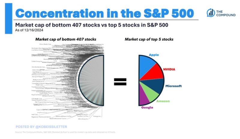
Shocking stat of the day: The market cap of the SP500’s top 5 stocks is now equal to the size of the bottom 407 stocks.
Apple, $AAPL, Nvidia, $NVDA, Microsoft, $MSFT, Google, $GOOGL, and Amazon, $AMZN are worth now a combined $15.3 trillion. These companies have added $5 TRILLION in market value since the beginning of last year. To put this into perspective, these 5 stocks are worth now nearly as much as China and Hong Kong's stock markets COMBINED. The top 5 companies reflect a record 24% of the entire US stock market cap. Source: Compound, The Kobeissi Letter
🚨US PPI DATA SHOULD PLEASE POWELL! December US PPI annual inflation rises 3.3%, below expectations for 3.5%.
vCore PPI inflation increased 3.5% Y/Y, compared to forecasts for a gain of 3.8%. BULLISH🚀 YoY Growth: 🇺🇸 PPI (Dec), 3.3% Vs. 3.5% Est. (prev. 3.0%) 🇺🇸 Core PPI, 3.5% Vs. 3.8% Est. (prev. 3.4%) MoM Growth: 🇺🇸 PPI (Dec), 0.2% Vs. 0.4% Est. (prev. 0.4%) 🇺🇸 Core PPI, 0.0% Vs. 0.3% Est. (prev. 0.2%)

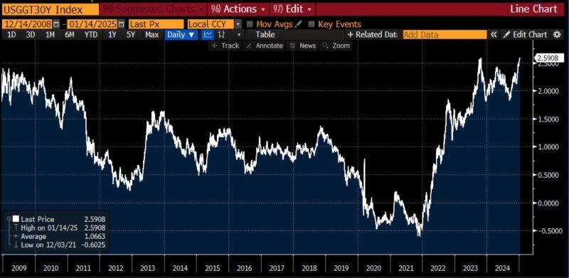
Real yields on 30-year US treasury bonds are now at 2008 levels.
It seems that bond markets are worried about much more than just inflation... Source: Adam Kobeissi, Bloomberg
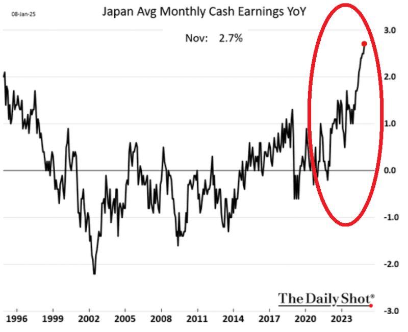
⚠️Bank of Japan is getting closer to deliver another rate hike:
Inflation has picked up while wages have jumped to the highest level in at least 3 DECADES. The market is pricing in about a 60% probability of a hike next week, and an 82% chance by March. Remember when in August 2024 the market flash crashed by suddenly waking up to BOJ's rate hikes? This is key to watch. Source: The Kobeissi Letter, The Daily Shot
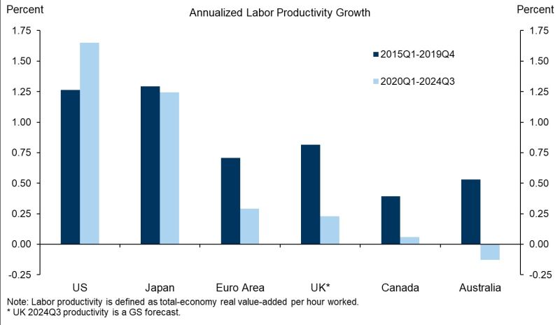
A stunning chart by Goldman: the outperformance of US productivity growth is remarkable, particularly in the COVID/post-COVID era.
Source: GS, Tony Pasquariello, Giovanni Pierdomenico
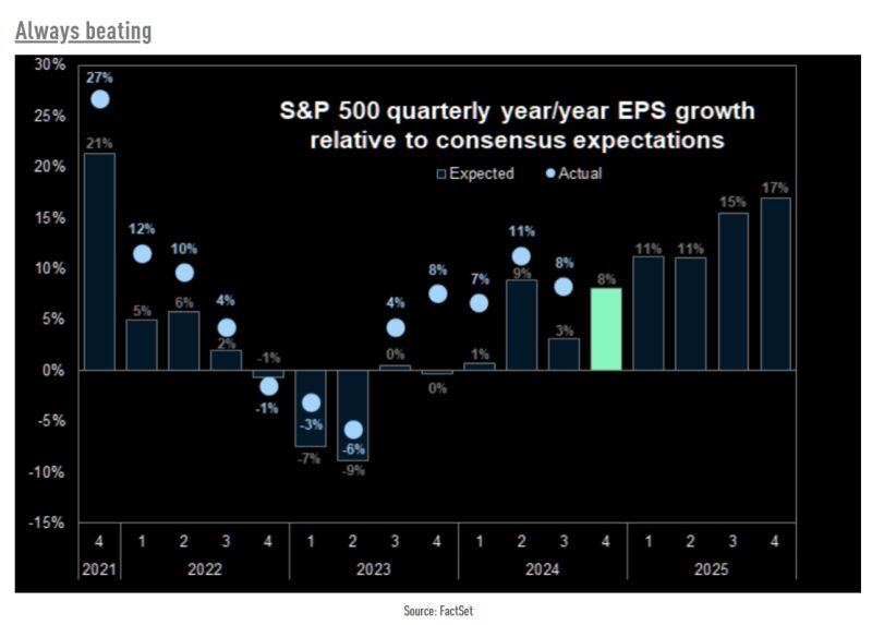
Actual S&P 500 earnings growth has exceeded expectations during the last few years.
Will it be the case again this quarter? Source: The Market Ear, Factset
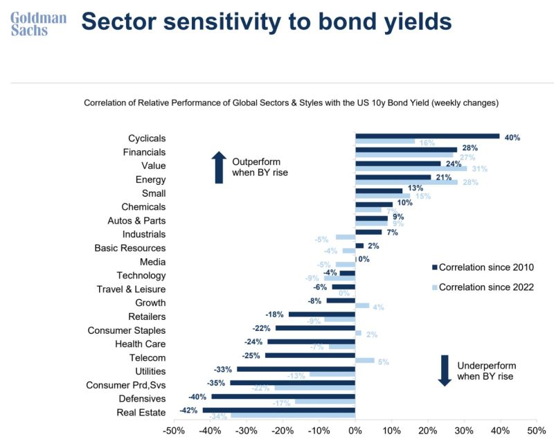
A good chart from GS that shows how sectors & factors may react to change in 10Y bond yields.
Source: Ayesha Tariq, CFA, Goldman Sachs
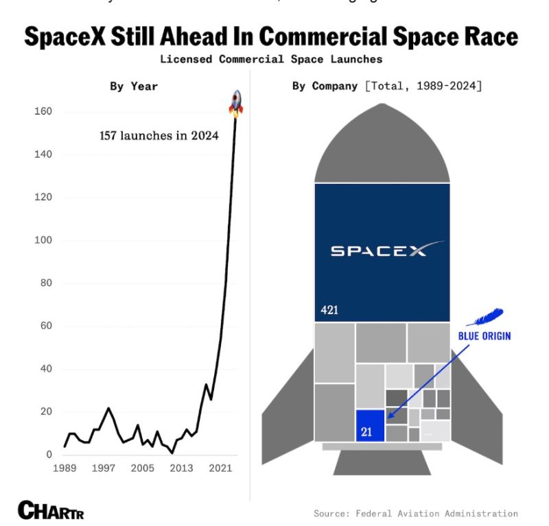
Musk’s company SpaceX is dominating the industry, responsible for a skyrocketing ~65% of the total licensed commercial launches in the US since its founding.
Blue Origin’s total launch count since its inception is only 16% of what SpaceX managed in 2024 alone. Source: Chartr