Straight from the Desk
Syz the moment
Live feeds, charts, breaking stories, all day long.
- All
- us
- Food for Thoughts
- equities
- Bonds
- technical analysis
- sp500
- bitcoin
- Stocks
- inflation
- China
- macro
- Federal Reserve
- ETF
- investing
- Crypto
- performance
- Central banks
- AI
- earnings
- gold
- Rate
- Real Estate
- markets
- debt
- Commodities
- Treasury
- tech
- yield
- nvidia
- europe
- Germany
- Japan
- bank
- fed
- oil
- warren-buffett
- nasdaq
- cpi
- apple
- Forex
- useful
- interest
- humor
- interest-rates
- market cap
- GDP
- quotes
- dollar
- energy
- returns
- hedge fund
- magnificent-7
- geopolitics
- valuations
- asset
- india
- finance
- BOJ
- ECB
- sentiment
- crudeoil
- Swiss
- Volatility
- highyield
- economy
- recession
- vix
- options
- cash
- semiconductor
- growth
- mortgage
- Money Market
- tesla
- Positioning
- charts
- exports
- trading
- bubble
- ipo
- price
- EM
- ESG
- EV
- deficit
- sales
- UK
- assetmanagement
- bearish
- wages
- Flows
- copper
- credit-card
- revenue
- russia
- saudiarabia
- spending
- yen
- Election
- Turkey
- cocoa
- futures
- index
- meta
- profit
- watches
- EUR
- bankruptcy
- chart
- consumers
- supply
- unemployment
- Brazil
- airlines
- amazon
- car
- credit-rating
- cryptocurrencies
- currencies
- manufacturing
- seasonality
- $nycb
- Asia
- FUNDS
- Renewable
- insider
- spx
- FUND
- africa
- deflation
- investmentgrade
- jobs
- microsoft
- productivity
- sec
- sharebuybacks
- spy
- taiwan
- yuan
- Alternatives
- Hong Kong
- SMCI
- SuperBowl
- charlie-munger
- compounding
- concentration
- debt-ceiling
- france
- lvmh
- msci
- pricing-power
- private markets
- smallcaps
- sustainable
- switzerland
- world-economy
- BOE
- Focus
- Industrial-production
- ceo
- chatgpt
- dowjones
- economic surprise
- ethereum
- fixed income
- greed
- halvings
- income
- leadership
- liquidity
- luxury
- moneydebasement
- retirement
- russel2000
- savings
- silver
- tax
- world
- EM Sovereign
- Granolas
- Market Outlook
- Nikkei
- TIPS
- brics
- corporate
- cost-of-living
- demographics
- dividend
- emerging-markets
- fashion
- gas
- greece
- jpmorgan
- lending
- monetarypolicy
- opec
- saudiaramco
- snb
- storytelling
- trump
- unicorn
- valentine's-day
- venture capital
- vietnam
- Beware
- CTAs
- Coinbase
- Convexity
- Crypto corner
- Deindustrialization
- GlobalAgg
- Italy
- Marketing
- Nestle
- Precious-Metals
- Rally
- SoftBank
- ToyotaMotor
- UAE
- bankrupt
- behavior
- booking.com
- calls
- childbirth
- cisco
- climate
- coal
- cobalt
- cocacola
- construction
- counterparty-risk
- cta
- design
- dragonyear
- elon musk
- eurozone
- fees
- financial-stress
- football
- golf
- hedgeye
- hungary
- imf
- intel
- international-women's-day
- job-cuts
- korea
- kpi
- lng
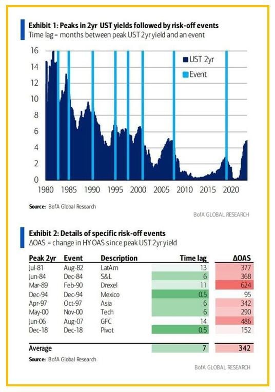
These charts by Bank of America show that every single episode of a local peak in UST 2yr yield was followed by some risk-negative event over the past 40 years.
These #charts by Bank of America show that every single episode of a local peak in UST 2yr yield was followed by some risk-negative event over the past 40 years. Such episodes ranged from mild (Mexican peso crisis in Dec 1995; HY +95bp) to moderate (Asia FX crisis in Oct 1997; HY +350bp ) to severe (GFC; HY all-time wides). The lag between the peak in 2yr yield and subsequent event varies from just a couple of weeks to just over a year, with an average being 7 months. Source: BofA, www.zerohedge.com
Investing with intelligence
Our latest research, commentary and market outlooks


